Modbus Monitor XPF HMI Guide
Use this as the single HMI guide page for XPF. It covers overview, dashboard management workflow, and widget reference in one place.
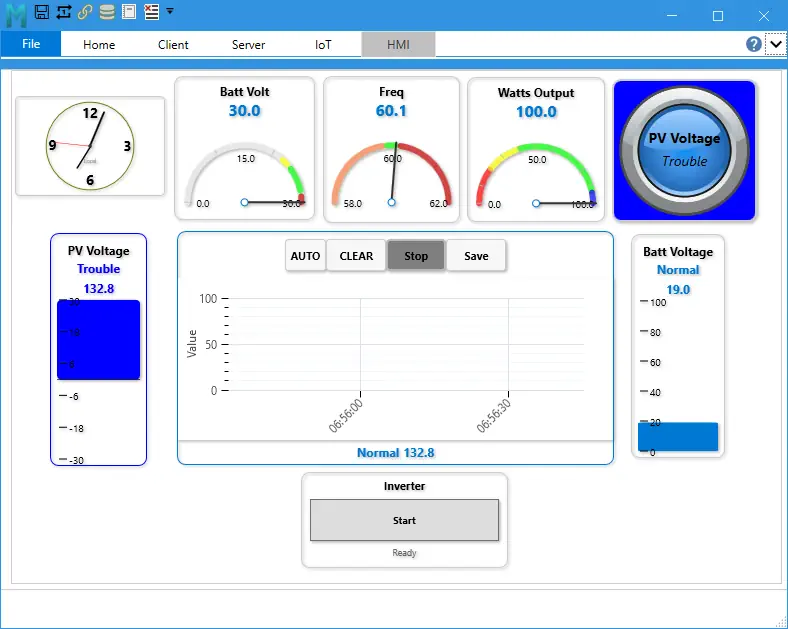
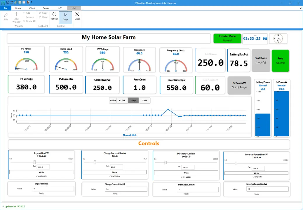 This is a example layout used in real-world commissioning and monitoring scenarios.
Build Industrial Dashboards Without Custom UI
The HMI feature in Modbus Monitor XPF lets you build live industrial dashboards in minutes using widgets connected directly to Modbus data.
Instead of building custom UI screens from scratch, you can assemble a working operator dashboard using ready-to-use components, real-time data binding, and reusable layouts.
This makes XPF ideal for commissioning, troubleshooting, and production monitoring where speed and clarity matter.
Use the HMI feature when you need:
- a live dashboard for commissioning
- a simple operator screen
- a reusable monitoring layout
- a quick way to test values, states, and controls together
- a fast alternative to building a full SCADA or custom HMI system
Why Use XPF for HMI
Traditional HMI or SCADA dashboards often require significant setup, custom development, or specialized tools.
With Modbus Monitor XPF, you can:
- Build dashboards in hours instead of weeks
- Reuse layouts across multiple systems using
.hmifiles - Combine monitoring, control, and visualization in one place
- Quickly validate system behavior during commissioning
- Reduce engineering effort for repeated projects
This makes XPF especially useful for engineers who need fast, reliable visibility without heavy setup overhead.
What You Can Build
Common uses include:
- real-time monitoring screens
- equipment status panels
- operator control panels
- setpoint adjustment screens
- trend views for changing values
- dashboards with time and event visibility
HMI Widget System Overview
Core Gauges and Status Widgets
Use these widgets to display live values and state changes in a clean, operator-friendly way:
NumericDial180Bar GraphMultiState Indicator
Interactive Controls
Use these widgets when operators need to safely interact with live systems:
ButtonSliderText Labelfor labels, messages, or optional text write scenarios
Advanced and Utility Widgets
Use these widgets to enhance dashboards with trends, time awareness, and visual structure:
TrendClockLineRounded RectangleArrowTrianglePolygonArc
Jump to Widget Reference.
Build Your First Dashboard (2-5 Minutes)
Most dashboards can be created in minutes using this workflow:
1. Open the HMI area
Open the HMI tab in XPF.
2. Add widgets
Choose the widget types needed for your dashboard.
3. Bind data
Connect each widget to the correct Modbus monitor point.
4. Configure properties
Set ranges, labels, colors, formatting, limits, and behavior.
5. Save the dashboard
Save the dashboard so it can be reopened, copied, or shared.
6. Run and monitor
Use the live dashboard for monitoring, troubleshooting, and operator interaction.
Jump to HMI Dashboard Management.
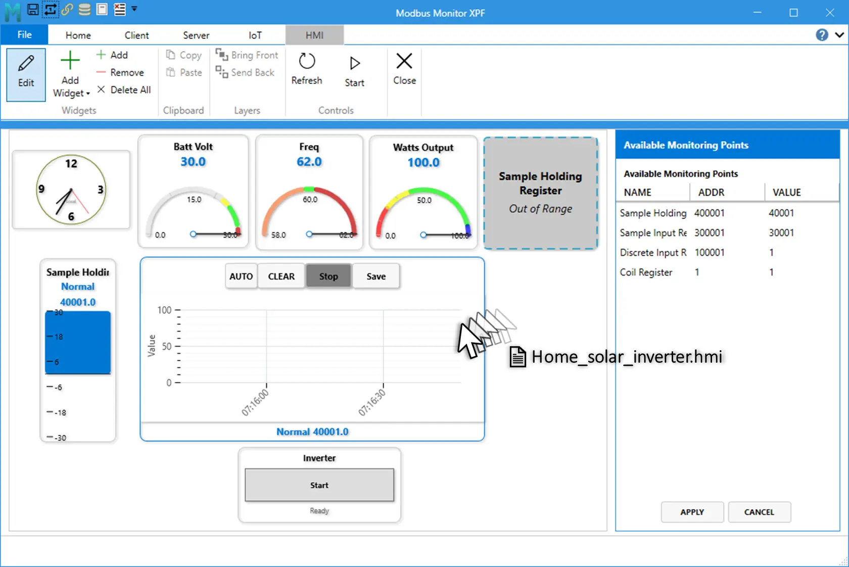
Reusable Dashboard Workflow
Supported file formats:
.hmifor dashboard packages with image assets
When loading dashboards:
- You can drag and drop a .hmi file directly onto the HMI background or canvas.
- If a .hmi file and a .csv file are in the same folder and share the same base name, XPF automatically finds and loads both.
- Example: line-a.hmi and line-a.csv.
This makes it easy to reuse dashboards across projects, share setups between teams, and standardize layouts.
This allows fast replication of dashboards across machines and projects.
Recommended First Dashboard
A simple first dashboard usually includes:
- one
Numericwidget - one
Dial180orBar Graph - one
MultiState Indicator - one
Trend - one
ButtonorSlider - one
Clock
This gives a balanced screen with value display, state visibility, trend history, and operator control.
Licensing Notes
This tiered approach lets you start simple and expand into advanced control and trending as your system grows.
HMI Dashboard Management
This reference helps you choose the right widget quickly and configure it correctly for reliable operation.
Ribbon Controls
| Group | Control | What It Does |
|---|---|---|
| Widgets | Edit | Turns design mode on or off |
| Widgets | Add Widget | Opens the full widget gallery |
| Widgets | Add | Adds a default widget |
| Widgets | Remove | Deletes selected widget |
| Widgets | Delete All | Clears all widgets from canvas |
| Clipboard | Copy | Copies selected widget (Ctrl+C) |
| Clipboard | Paste | Pastes a duplicate (Ctrl+V) |
| Controls | Refresh | Reloads current values |
| Controls | Start/Stop | Starts or stops monitoring engine |
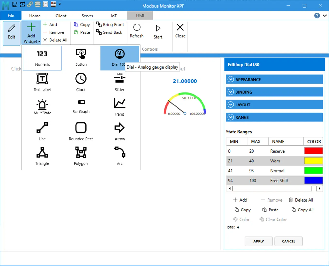
Add, Configure, and Validate Widgets
- Turn Edit on.
- Click Add Widget and pick a widget type.
- Set Monitoring Point.
- Configure range and display properties.
- Add state ranges for widgets that support state logic.
- Turn Edit off and validate runtime behavior.
Copy and Paste
- Copy keeps widget properties, style, binding, and state ranges.
- Paste creates a new widget with a new ID and position offset.
Save and Load
See Save and Load Behavior above for file types and auto-pair behavior.
Shape Tip: Ellipse from Rounded Rectangle
- Set
RadiusX = Width / 2 - Set
RadiusY = Height / 2
Example circle:
Width=120,Height=120,RadiusX=60,RadiusY=60
Widget Reference
Use this section for widget setup, key properties, and min/max ranges.
Widget List
| # | Widget | Register Binding | Write Support | Free | Basic | Pro | Best Use |
|---|---|---|---|---|---|---|---|
| 1 | Numeric | Required | No | Yes | Yes | Yes | Clear process value display |
| 2 | Button | Required | Yes | No | No | Yes | One-click command/write |
| 3 | Dial180 | Required | No | No | Yes | Yes | Analog-style gauge view |
| 4 | Text Label | Optional | Optional | Yes | Yes | Yes | Titles, notes, text values |
| 5 | Clock | Not required | No | Yes | Yes | Yes | Time on dashboard |
| 6 | Slider | Required | Yes | No | No | Yes | Setpoint adjustment |
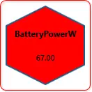
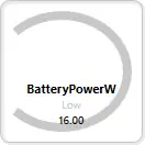
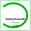
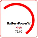
| 7 | MultiState Indicator | Required | No | No | Yes | Yes | State by value range |
| 8 | Bar Graph | Required | No | No | Yes | Yes | Fill-level visualization |
| 9 | Trend | Required | No | No | No | Yes | Real-time history trend |
| 10 | Line | Optional | No | No | Yes | Yes | Direction/flow line |
| 11 | Rounded Rectangle | Optional | No | No | Yes | Yes | Status tile / shape zone |
| 12 | Arrow | Optional | No | No | Yes | Yes | Direction indicator |
| 13 | Triangle | Optional | No | No | Yes | Yes | Compact directional marker |
| 14 | Polygon | Optional | No | No | Yes | Yes | Multi-sided status marker |
| 15 | Arc | Optional | No | No | Yes | Yes | Arc/sector indicator |
License note:
Free: core view-only widgets (Numeric,Text Label,Clock)Basic: adds advanced display widgets and shape widgetsPro: adds control widgets (Button,Slider) andTrend
Quick Setup Rules
- Bind Monitoring Point first.
- Set Minimum/Maximum when the widget has a range.
- Set labels and formatting.
- Add state ranges where supported.
- Turn Edit off and validate runtime behavior.
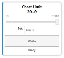
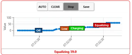
State Ranges (Property Window)
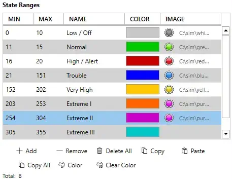
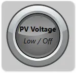
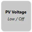
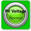
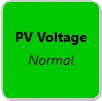
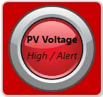
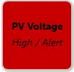
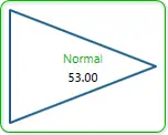
Use State Ranges in the property panel for widgets that converts values into the colors, names, and images. For example the MultiState Indicator takes the numberical value and changes the widget background to color red, name running, image red LED).
State ranges define behavior by value window:
Min <= CurrentValue <= Max(inclusive bounds)- First matching range is applied
- If no range matches, widget uses its default state style
Table Columns
| Column | Purpose | Example |
|---|---|---|
MIN |
Lower inclusive bound | 0 |
MAX |
Upper inclusive bound | 20 |
NAME |
State label shown by widget | Low / Off |
COLOR |
State color preview and picker target | Gray |
Property Window Actions
| Action | What It Does | Notes |
|---|---|---|
Add |
Adds a new state row | Starts with default values you can edit |
Remove |
Removes selected row | Requires row selection |
Delete All |
Clears all ranges | Widget falls back to default state styling |
Copy |
Copies selected range | Useful for quick duplication |
Paste |
Pastes copied range(s) | Preserves values/colors/names |
Copy All |
Copies entire range set | Helpful between similar widgets |
Color |
Opens color picker for selected range | Use to set final visual state color |
Clear Color |
Clears selected color override | Reverts to default handling |
Matching and Priority Rules
- Evaluation is continuous as values update.
- Overlapping ranges are allowed, but top-first match wins.
- Gaps are allowed; gap values use default state style.
- Recommended practice: keep ranges contiguous and non-overlapping for predictable behavior.
Example ordered ranges:
0-20->Low / Off21-60->Normal61-100->High / Alert
Visual Highlighting Behavior
Range-capable widgets can visually emphasize the active state range at runtime. Typical pattern:
- Active range: stronger emphasis (for example thicker stroke/full opacity)
- Inactive ranges: reduced emphasis
This gives immediate feedback when the live value moves across thresholds.
Save and Load Behavior for State Ranges
State ranges are persisted in widget JSON during dashboard save and restored during load. Saved fields include:
MinValueMaxValueStateNameStateColor- optional
ImagePathwhere supported
If a widget supports image-backed states, image paths are included in HMI package workflows via widget image collection.
Key Widget Property Summary
| Widget | Core Properties |
|---|---|
| Numeric | Monitoring Point, DisplayFormat, MinValue, MaxValue |
| Button | Monitoring Point, WriteValue, MinValue, MaxValue |
| Dial180 | Monitoring Point, Minimum, Maximum, StartAngle, SweepAngle |
| Text Label | DisplayText, optional binding |
| Clock | TimeFormat, DisplayMode, ShowSeconds |
| Slider | Monitoring Point, MinValue, MaxValue, SliderStep |
| MultiState Indicator | Monitoring Point, StateRanges |
| Bar Graph | Minimum, Maximum, Orientation, BipolarCenter |
| Trend | Minimum, Maximum, SampleCount, RenderStyle |
| Line | LineThickness, Orientation, AngleDegrees |
| Rounded Rectangle | RadiusX, RadiusY, StrokeThickness, RotationDegrees |
| Arrow | HeadLengthPercent, ShaftThicknessPercent, RotationDegrees |
| Triangle | Orientation, StrokeThickness, RotationDegrees |
| Polygon | SideCount, StrokeThickness, RotationDegrees |
| Arc | StartAngle, SweepAngle, StrokeThickness, RotationDegrees |
Per-Widget Details
Numeric
- Purpose: compact numeric value display bound to one monitoring point.
- Binding: required.
- Main properties:
WidgetLabel,DisplayFormat,FontSize,TextColor,ShowLabel,MinValue,MaxValue. - Ranges and limits: default range is
0to unbounded max; state ranges can be used for color changes; display formatting follows the configured decimal-place settings. - Notes: use this when operators need the exact current value, not a write control.
Button
- Purpose: one-click write command to a bound register with preset value.
- Binding: required.
- Main properties:
WidgetLabel,ButtonLabel,WriteValue,ShowLabel,ShowValueTextBox,MinValue,MaxValue. - Ranges and limits:
WriteValuedefaults to1.0; optionalMinValueandMaxValueclamp user input before write; status text clears automatically after the write completes. - Notes: best for fixed commands such as start, stop, reset, or mode selection. This is a Pro-tier control widget.
Dial
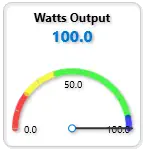
- Purpose: analog-style needle gauge with configurable arc.
- Binding: required.
- Main properties:
Monitoring Point,Show Label,Display Name,Show Scale,Show Border,Value Format,Start Angle (deg),Sweep Angle (deg),Gauge Minimum,Gauge Maximum,Operating Minimum,Operating Maximum,Major Tick Step,Minor Tick Step,Width,Height. - Ranges and limits: default visual range is
Gauge Minimum = 0andGauge Maximum = 100; default dial geometry isStart Angle = 180andSweep Angle = -180; default operating range is0-100; tick defaults are20major and10minor; widget layout range in the property editor isWidth 100-800andHeight 100-600; gauge maximum is normalized so it cannot remain below minimum. - Notes: use this when you want an analog gauge look with clear tick marks rather than a raw number. The current code exposes
Value FormatandShow Scale; the quick-reference mentionsRangeFormatandShowNeedle, but those are not separate user-editable properties in the current implementation.
Dial Drawing Rules
Use these geometry rules when drawing a dial:
Start Angle (deg)places the minimum-value end of the dial.Sweep Angle (deg)controls how far the dial travels from minimum to maximum.- Negative sweep values draw clockwise in the current implementation and are the standard choice for the built-in recipes.
0 = East,90 = North,180 = West,270or-90 = South.Major Tick Step = 0hides major and minor tick generation in practice.Minor Tick Step = 0hides only the minor ticks.
Direction Cheat Sheet
| Direction | Start Angle | Meaning |
|---|---|---|
| East | 0 |
Minimum starts at the right side, around 3 o'clock |
| North | 90 |
Minimum starts at the top, around 12 o'clock |
| West | 180 |
Minimum starts at the left side, around 9 o'clock |
| South | 270 or -90 |
Minimum starts at the bottom, around 6 o'clock |
Dial Recipe Table
| Dial Style | Start Angle (deg) | Sweep Angle (deg) | Major Tick Step | Minor Tick Step | What It Draws |
|---|---|---|---|---|---|
| Classic 180 horizontal | 180 |
-180 |
20 |
10 |
Standard semicircle from west to east across the top |
| Inverted 180 | 90 |
-180 |
10 |
5 |
Semicircle flipped so the sweep runs across the lower half |
| Industrial 270 | 225 |
-270 |
25 |
5 |
Three-quarter dial with mid-scale pointing down |
| Compact temperature arc | 200 |
-140 |
10 |
5 |
Narrower partial arc for tight layouts |
| East-facing half dial | 0 |
-180 |
20 |
10 |
Semicircle starting on the right side |
| North-facing half dial | 90 |
-180 |
20 |
10 |
Semicircle starting at the top |
| West-facing half dial | 180 |
-180 |
20 |
10 |
Semicircle starting on the left side |
| South-facing half dial | 270 |
-180 |
20 |
10 |
Semicircle starting at the bottom |
| Near full circle | 225 |
-359 |
30 |
10 |
Almost complete ring while avoiding a closed 360-degree overlap |
| Arbitrary custom dial | 45 |
-180 |
20 |
10 |
Half dial starting around the 1:30 position |
Parameter Table
| Property | Purpose | Default | Validated Behavior in Code |
|---|---|---|---|
Start Angle (deg) |
Places the minimum end of the dial | 180 |
Used directly by arc and tick converters; 0 right, 90 up, 180 left |
Sweep Angle (deg) |
Sets dial span and direction | -180 |
Used directly by arc and tick converters; negative values produce the standard clockwise sweep |
Gauge Minimum |
Visual scale minimum | 0 |
If maximum is set lower than minimum, maximum is normalized up to minimum |
Gauge Maximum |
Visual scale maximum | 100 |
Cannot remain below minimum |
Operating Minimum |
Lower operating band for display and state logic | 0 |
Used for operating-range highlighting and display clamping |
Operating Maximum |
Upper operating band for display and state logic | 100 |
Explicitly setting it enables display clamping behavior |
Major Tick Step |
Spacing between major ticks | 20 |
Exposed in property editor; use 0 to suppress visible tick generation |
Minor Tick Step |
Spacing between minor ticks | 10 |
Exposed in property editor; use 0 to hide minor ticks |
Value Format |
Number formatting for value and tick labels | blank | Blank falls back to the global decimal-place setting |
Show Scale |
Shows or hides tick marks and scale labels | true |
Bound directly in the view |
Recommended Setup Order
- Set
Monitoring Point. - Set
Gauge MinimumandGauge Maximumfor the full scale. - Set
Operating MinimumandOperating Maximumif you want an operating band separate from the full gauge scale. - Pick
Start Angle (deg)andSweep Angle (deg)from the recipe table. - Adjust
Major Tick StepandMinor Tick Stepfor coarse or dense ticks. - Set
Value Formator leave it blank to use global decimal places.
Text Label
- Purpose: static text or optional bound text value.
- Binding: optional. Use static mode for labels and notes, or enable Modbus mode for a bound text/value display.
- Main properties:
DisplayText,IsModbusEnabled,EnableWrite,WidgetLabel,FontSize,TextColor,ShowLabel,WriteValue. - Ranges and limits:
FontSizeis clamped to8-72; text write support is license-gated; if Modbus is disabled the widget showsDisplayText, otherwise it shows the bound value. - Notes: use this for titles, instructions, annotations, and simple text-driven status. Write mode is an advanced Pro-tier scenario.
Clock
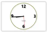
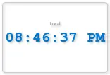
- Purpose: live system clock widget with dual display modes (digital and analog); no register binding required.
- Binding: not required.
- Main properties:
Show Label,Show Border,Display Mode,Time Format,Show Seconds,Time Zone,Width,Height. - Ranges and limits:
Display ModesupportsDigitalorAnalog;Time Formatsupports12hor24h;Time ZoneacceptsLocal,UTC,UTC±offset(e.g.,UTC+5.5,UTC-8), or Windows timezone IDs; width and height range from50to2000pixels; if an invalid timezone is specified, the widget falls back to system local time. - Notes: the widget updates from system time every 500 milliseconds to one second. Use it for timestamp visibility on operator panels, wallboard dashboards, or any screen requiring live time display.
- Add multiple clocks to build the world-clock with different time zones.
Clock Time Format Examples
| Time Format | 12h Example | 24h Example | Display When ShowSeconds = false |
|---|---|---|---|
12h with seconds |
2:45:30 PM |
N/A | 2:45 PM |
24h with seconds |
N/A | 14:45:30 |
14:45 |
Clock Time Zone Options
Predefined Options:
- System Local:
Local(uses operating system timezone) - UTC:
UTC(Coordinated Universal Time) - UTC Offsets:
UTC-12throughUTC+12in 1-hour increments (e.g.,UTC+5.5for India Standard Time) - Windows TimeZone IDs:
Eastern Standard Time,Central Standard Time,Mountain Standard Time,Pacific Standard Time,GMT Standard Time,Central European Standard Time,India Standard Time,Singapore Standard Time,AUS Eastern Standard Time,New Zealand Standard Time, and others
Fallback Behavior:
When you specify a timezone:
- The widget attempts to find it via Windows
System Time Zone By ID - If not found, it parses as a UTC offset string (e.g.,
UTC+5.5) - If parsing fails, it falls back to system local time
Clock Parameter Table
| Property | Purpose | Default | Validated Behavior in Code |
|---|---|---|---|
Show Label |
Display widget label above or below clock | true |
Toggled directly in property editor |
Show Border |
show 3D border/shadow around widget | true |
Toggled directly in property editor |
Display Mode |
Clock style: digital numbers or analog hands | Digital |
Dropdown: Digital or Analog; property change triggers re-render |
Time Format |
How to display time on digital mode | 24h |
Dropdown: 12h (with AM/PM) or 24h (24-hour); changing format triggers UpdateTime() which reformats the display string and recalculates analog hand rotations |
Show Seconds |
Include seconds in time display | true |
Toggled directly in property editor; toggling triggers UpdateTime() to switch between HH ss ↔ HH:mm format ss ↔ HH:mm format |
Time Zone |
Which timezone to display | Local |
Text/dropdown; accepts Local, UTC, UTC±offset, or Windows timezone names; invalid zones fall back to local time via robust validation chain |
Width |
Clock widget width in pixels | 150 | Numeric; clamped to 50–2000 pixel range |
Height |
Clock widget height in pixels | 100 | Numeric; clamped to 50–2000 pixel range; aspect ratio not enforced, so you can stretch or compress |
Recommended Clock Setup Order
- Optionally set
Display Name/ widget label viaShow Label. - Choose
Display Mode:Digitalfor numeric time orAnalogfor clock face. - Choose
Time Format:12hwith AM/PM or24hmilitary time. - Optionally toggle
Show Seconds. - Set
Time Zoneif you need a timezone other than system local. - Adjust
WidthandHeightto fit your dashboard layout.
Slider
- Purpose: setpoint adjustment by dragging, with optional live updates or manual write-button confirmation.
- Binding: required.
- Main properties:
Monitoring Point,Display Name,Show Label,Show Border,Font Size,Label Color,Minimum Value,Maximum Value,Tick Frequency,Default Write Value,Enable Live Updates,Show Write Button,Width,Height. - Ranges and limits: default range is
0to100;Tick Frequency(slider step) must be>0and defaults to1.0(forced to1if set to0or negative);Default Write Valueis automatically snapped to the nearest tick and clamped to the range; all snapping and clamping re-applies when you change the range or step; widget layout range isWidth 120-400andHeight 100-400. - Notes: use
Enable Live Updates = false(default) for safe manual writes with a button click and status feedback; useEnable Live Updates = trueonly when continuous writes during drag are acceptable. This is a Pro-tier control widget.
Slider Write Modes
Two modes control when values are written to the Modbus register:
- Manual Write Mode (Default,
Enable Live Updates = false) - Slider drag updates the display value only; no register write occurs.
- Click the Write button to send the value to the register.
- Status displays
"✓ Wrote {value} to {register}"and clears after 2 seconds. -
Safe for slow-responding devices or when you want operator confirmation before each write.
-
Live Update Mode (
Enable Live Updates = true) - Every slider drag position immediately writes to the register.
- No Write button needed (even if
Show Write Button = true, it has no effect). - Status shows
"✓ Live Update"but does not auto-clear. - Useful for real-time trim, PID feedback, or quick response-required scenarios.
Slider Step and Snap Behavior
The slider snaps all values to the nearest tick:
Tick Frequency = 1.0→ snaps to integers: 0, 1, 2, ... 100Tick Frequency = 0.1→ snaps to tenths: 0.0, 0.1, 0.2, ... 100.0Tick Frequency = 5→ snaps to fives: 0, 5, 10, ... 100
Every WriteValue assignment and range/step change triggers the snap pipeline:
- Clamp to
[Minimum Value, Maximum Value] - Round to nearest tick based on
Tick Frequency - Re-clamp, round to 10 decimals
This ensures displayed and written values always align with the tick marks.
Slider Recipe Table
| Use Case | Min | Max | Tick Step | Live Update | Write Button | Notes |
|---|---|---|---|---|---|---|
| Setpoint (manual safe) | 0 |
100 |
1 |
false |
true |
Drag, review, click Write; 2s status feedback |
| Fine-grained setpoint | 0 |
100 |
0.1 |
false |
true |
Precise 0.1° or 0.1% adjustment with confirmation |
| Integer-only (counts) | 1 |
10 |
1 |
false |
true |
Select whole counts: 1, 2, ... 10 without decimals |
| Continuous trim/PID | 0 |
100 |
0.5 |
true |
false |
Real-time feedback control; every drag writes immediately |
| Pressure setpoint (psi) | 50 |
150 |
1 |
false |
true |
50–150 psi in 1 psi increments |
| Temperature setpoint (°C) | 15 |
30 |
0.5 |
false |
true |
15–30°C in 0.5° steps with manual confirmation |
| Percentage control | 0 |
100 |
5 |
true |
false |
0%, 5%, 10%, ... , 100% live trim |
| Ratio/multiplier | 0.5 |
2.0 |
0.1 |
true |
false |
0.5× to 2× scaling factor with continuous update |
Slider Parameter Table
| Property | Purpose | Default | Validated Behavior in Code |
|---|---|---|---|
Monitoring Point |
Modbus register to bind and write to | — | Required; register value initializes the slider position; changed register resets slider to that register's value |
Display Name |
Widget label text | "Value" |
Falls back to bound register name if empty |
Show Label |
Display widget label | true |
Toggled directly in property editor |
Show Border |
3D border/shadow | true |
Toggled directly in property editor |
Font Size |
Size of label and value text | 14 |
Numeric input; no range limits in editor |
Label Color |
Color of label and value text | #FF000000 (black) |
Hex color picker |
Minimum Value |
Lower bound of slider range | 0.0 |
Numeric; if set higher than Max, Max auto-adjusts to equal Min |
Maximum Value |
Upper bound of slider range | 100.0 |
Numeric; normalized so it cannot be set below Min; clamps WriteValue and SliderStep when changed |
Tick Frequency |
Step size for slider snapping | 1.0 |
Numeric; forced to minimum 1.0 if set to 0 or negative; all values snap to nearest tick |
Default Write Value |
Initial/button-click value | 0.0 |
Snapped to nearest tick and clamped to range on assignment; tied to register sync via _isSyncingFromRegister guard |
Enable Live Updates |
Write on every drag vs. write-button only | false |
When true, writes fire every time slider position changes; when false, writes only occur on button click |
Show Write Button |
Display Write/confirm button | true |
Toggled directly in property editor; button is always available in manual mode, ignored in live mode |
Width |
Widget width in pixels | 200 |
Numeric; clamped to 120–400 pixel range |
Height |
Widget height in pixels | 140 |
Numeric; clamped to 100–400 pixel range |
Recommended Slider Setup Order
- Set
Monitoring Pointto bind the slider to a register. - Set
Minimum ValueandMaximum Valuefor the operating range (e.g.,50–150for pressure,0–100for percentage). - Set
Tick Frequencyto the desired step size (e.g.,1for whole units,0.1for fine-grained control). - Set
Default Write Valueto a safe initial position (usually close to mid-range or the present register value). - Choose
Enable Live Updates:falsefor safe manual writes with confirmation,truefor real-time continuous feedback. - Adjust
Font Size,Label Color,Width,Heightto fit your dashboard layout and readability.
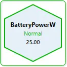
MultiState Indicator
- Purpose: state display using color/image by value range or boolean mode.
- Binding: required.
- Main properties:
Monitoring Point,Boolean Mode,Custom Label,Show Label,Show State Name,Show Value,Font Size,Text Color,Show Border,Default State Color. - Ranges and limits: each range uses inclusive bounds (
Min <= Value <= Max); ifMaxis set belowMin, it is normalized up toMin; first matching range wins when ranges overlap; default fallback color is RGB(200,200,200) (#FFC8C8C8) when no range matches. - Notes: each state range can carry both
Colorand optionalImage; when an active range has an image path, the image is shown on top of the background state color.
MultiState Configuration Modes
Two modes control how values are interpreted:
- Range-Based Mode (Default,
Boolean Mode = false) - Compares value against a list of ranges
- Each range:
Min ≤ Value ≤ Max→ shows color and name - First match wins; gaps fall back to default color
-
Example:
0-20= Gray (Low),21-60= Green (Normal),61-100= Red (High) -
Boolean Mode (Legacy Toggle,
Boolean Mode = true) - Property exists and is persisted for compatibility with older HMI files.
- In current code path, state selection is still range-driven via
StateRangesmatching. - Practical use: configure two ranges (for example
0-0and1-1or1-100) to implement on/off behavior.
State Ranges Grid (Matches Property Panel)
| Column | Purpose | Code-Backed Behavior |
|---|---|---|
MIN |
Lower inclusive bound | Value matches when CurrentValue >= Min |
MAX |
Upper inclusive bound | Value matches when CurrentValue <= Max; if set below MIN, it is auto-normalized to MIN |
NAME |
Display name of active state | Rendered by CurrentStateName when Show State Name = true |
COLOR |
State background color | Applied to widget background as CurrentStateColor |
IMAGE |
Optional image path per state | When non-empty on active state, shown as overlay (CurrentStateImagePath) |
State range actions in the panel (Add, Remove, Delete All, Copy, Paste, Copy All, Color, Clear Color) operate on these same StateRanges rows.
MultiState Indicator Recipe Table
| State Pattern | Boolean Mode | Range Count | Default Color | Typical Use Case |
|---|---|---|---|---|
| Simple On/Off | true |
— | Gray | Device power, switch status |
| Three-state (Low/Normal/High) | false |
3 |
Gray | Temperature, pressure, level |
| Five-state (health) | false |
5 |
Gray | System health: Offline/Idle/Running/Warning/Critical |
| Binary fault | true |
— | Red | Alarm triggered (0=ok, 1=alarm) |
| Load capacity | false |
4 |
Gray | 0-25% Empty (Blue), 26-75% Normal (Green), 76-99% Full (Yellow), 100% Overflow (Red) |
| Traffic light | false |
3 |
Gray | Stop (Red) 0-30, Caution (Yellow) 31-60, Go (Green) 61-100 |
| Equipment mode | false |
6 |
Gray | 1=Init (Gray), 2=Idle (Blue), 3=Run (Green), 4=Pause (Yellow), 5=Error (Red), 6=Unknown (Black) |
| Pump status | false |
4 |
Gray | 0=Off (Gray), 1-50% Startup (Blue), 51-99% Running (Green), 100% Max (Yellow) |
MultiState Indicator Parameter Table
| Property | Purpose | Default | Validated Behavior in Code |
|---|---|---|---|
Monitoring Point |
Modbus register to monitor | — | Required; changed register clears indicator state |
Boolean Mode |
Legacy mode toggle | false |
Property is exposed and persisted; current state matching still uses StateRanges evaluation |
Custom Label |
Optional display label | blank | Falls back to register name if empty |
Show Label |
Display label text | true |
Toggled directly in property editor |
Show State Name |
Display current state name | true |
Toggled directly in property editor |
Show Value |
Display numeric value | false |
Toggled directly in property editor |
Default State Color |
Color when out of range | #FFC8C8C8 |
Used when no state range matches or when no register is bound |
Font Size |
Size of displayed text | 14 |
Numeric input |
Text Color |
Color of label/value text | #FF000000 (black) |
Hex color picker |
Show Border |
3D border/shadow | true |
Toggled directly in property editor |
State Ranges |
Min/Max/Name/Color/Image rows |
3 default rows | Default rows: Low / Off (0-20), Normal (21-60), High / Alert (61-100); first match wins |
Recommended MultiState Setup Order
- Set
Monitoring Point. - Choose
Boolean Modeor leave it off for range-based. - If range-based (default), open the Range Editor and configure Min/Max/Color/Name for each state.
- Set
Default State Colorfor out-of-range fallback. - Toggle
Show Label,Show State Name,Show Valueas desired. - Adjust
Font SizeandText Colorfor visibility.
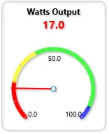
Bar Graph
- Purpose: fill-level visualization for one bound register.
- Binding: required.
- Main properties:
Monitoring Point,Show Label,Display Name,Background Image,Show Value,Show Scale,Show Border,Gauge Minimum,Gauge Maximum,Bipolar,Bipolar Center,Value Format,Orientation,Width,Height. - Ranges and limits: default range is
Gauge Minimum = 0andGauge Maximum = 100;OrientationsupportsNorth,South,East, andWest;BipolarCenteris automatically clamped inside the active range; default size is200×140with layout limits80-800width and60-600height; state ranges can be used to change bar color based on value. - Notes: use bipolar mode when a center reference matters, such as negative-to-positive deviation around a neutral value. Use state ranges for color-coded alerting.
Bar Graph Orientation Rules
North: bar fills from bottom upward when value increases (default)South: bar fills from top downwardEast: bar fills from left to rightWest: bar fills from right to leftBipolar: bar extends from the center (BipolarCenter) toward the value; negative deviations fill in the opposite direction
Bar Graph Recipe Table
| Gauge Style | Orientation | Bipolar | Bipolar Center | Gauge Min | Gauge Max | State Ranges | Best Use |
|---|---|---|---|---|---|---|---|
| Classic vertical bar | North |
No | — | 0 |
100 |
Optional | Liquid level, tank fill |
| Inverted bar | South |
No | — | 0 |
100 |
Optional | Pressure drop, descent speed |
| Horizontal bar (left-right) | East |
No | — | 0 |
100 |
Optional | Filling or loading progress |
| Horizontal bar (right-left) | West |
No | — | 0 |
100 |
Optional | Consumption or drain rate |
| Bidirectional centered | North |
Yes | 50 |
0 |
100 |
Optional | Deviation from setpoint (±50) |
| Temperature deviation | North |
Yes | 37 |
32 |
42 |
3+ states | Human temperature (±5 degrees) |
| Pressure deviation | East |
Yes | 100 |
80 |
120 |
3+ states | Pressure vs nominal (±20 psi) |
| Speed deviation | North |
Yes | 3000 |
0 |
6000 |
2+ states | RPM vs target (±3000) |
Bar Graph Parameter Table
| Property | Purpose | Default | Validated Behavior in Code |
|---|---|---|---|
Monitoring Point |
Modbus register to display | — | Required; widget clears data if register changes |
Gauge Minimum |
Visual scale minimum | 0 |
If max is set lower, max is normalized up |
Gauge Maximum |
Visual scale maximum | 100 |
Cannot remain below minimum |
Orientation |
Fill direction | North |
Dropdown: North, South, East, West |
Bipolar |
Enable center fill mode | false |
When true, fills from BipolarCenter in both directions |
Bipolar Center |
Center point for bipolar fill | 0 |
Auto-clamped inside active range [min, max] |
Value Format |
Number formatting | F1 |
.NET format string; blank uses global decimal places |
Show Value |
Display current value | true |
Toggled directly in property editor |
Show Scale |
Show min/max labels | true |
Toggled directly in property editor |
Show Label |
Show widget label | true |
Toggled directly in property editor |
Background Image |
Fallback image when no state matches | blank | Optional; overridden by state image if range matches |
Width |
Widget width | 200 |
Clamped 80–800 |
Height |
Widget height | 140 |
Clamped 60–600 |
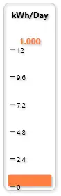
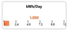
Trend
 {loading="lazy" }
 {loading="lazy" }
- Purpose: real-time value history charting.
- Binding: required.
- Main properties:
Monitoring Point,Show Label,Background Image,Show Current Value,Show Grid Lines,Show Border,Show Chart Title,Show Control Buttons,Chart Minimum,Chart Maximum,Value Format,Max Data Points,Sample Interval (sec),Enable Live Update,Save to File,Render Style,Width,Height. - Ranges and limits: default Y-axis range is
0-100;Max Data Pointsdefaults to100and is clamped to a minimum of10unless set to0for unlimited;Sample Interval (sec)defaults to1.0and is effectively clamped to>= 0.1in code;Render StylesupportsLine,Scatter,Area, andStep; default size is400×250with editor limitsWidth 150-1200andHeight 100-800. - Notes: this is a Pro-tier analytics widget and the largest default widget on the canvas. Use it when users need recent history, not just current state. State ranges can colorize the plot, and
Save to Fileexports CSV data into the Documents folder.
Trend Render Styles
| Render Style | Visual | Best For |
|---|---|---|
Line |
Continuous curve connecting points | Smooth trend visualization, default choice |
Scatter |
Discrete point markers | Precise moment-in-time readings, sparse data |
Area |
Filled area under the line | Cumulative effect, visual emphasis |
Step |
Stair-step transitions between values | Discrete states, counters, or held values |
Trend Data Collection Cheat Sheet
| Setting | Practical Meaning | Code-Backed Note |
|---|---|---|
Max Data Points = 0 |
Unlimited history in memory | Code keeps all samples until cleared |
Max Data Points = 100 |
Rolling window of 100 samples | Oldest points are removed as new ones arrive |
Sample Interval = 1.0 |
Roughly 1 sample per second | Default collection interval |
Sample Interval < 0.1 |
Not allowed in practice | Setter clamps to 0.1 seconds minimum |
Enable Live Update = false |
Chart exists but does not collect new samples | Runtime controls or property toggle must enable collection |
Save to File = true |
Persist samples to CSV | Writes chart data to Documents folder |
Trend Recipe Table
| Trend Scenario | Render Style | Max Data Points | Sample Interval | Show Grid | Min | Max | Purpose |
|---|---|---|---|---|---|---|---|
| Real-time line | Line |
100 |
1.0 sec |
true |
0 |
100 |
Default smooth trend |
| Precision readout | Scatter |
50 |
1.0 sec |
true |
0 |
100 |
Point-in-time values |
| Filled area (load) | Area |
100 |
1.0 sec |
true |
0 |
100 |
Visual fill under curve |
| Discrete machine states | Step |
100 |
1.0 sec |
true |
0 |
5 |
State transitions where values hold until the next event |
| Long history | Line |
500 |
1.0 sec |
false |
0 |
100 |
Extended time window |
| Dense data | Scatter |
200 |
0.5 sec |
false |
0 |
100 |
High-frequency sampling |
| Sparse data | Line |
30 |
5.0 sec |
true |
0 |
100 |
Low-frequency updates |
| Temperature trend | Area |
100 |
1.0 sec |
true |
-50 |
50 |
Temperature deviation |
| Pressure trend | Line |
120 |
1.0 sec |
true |
80 |
120 |
Pressure stability |
Trend Parameter Table
| Property | Purpose | Default | Validated Behavior in Code |
|---|---|---|---|
Monitoring Point |
Modbus register to trend | — | Required; clearing register clears all trend data |
Show Label |
Show widget label above chart | true |
Toggled directly in property editor |
Background Image |
Optional image behind the plot | blank | Image picker; purely visual backdrop |
Show Current Value |
Display current register value | true |
Toggled directly in property editor |
Show Grid Lines |
Display major/minor chart grid lines | true |
Toggled directly in property editor; refreshes plot axes |
Show Border |
3D border/shadow around widget | true |
Toggled directly in property editor |
Show Chart Title |
Show label inside plot area | false |
Updates the OxyPlot title on change |
Show Control Buttons |
Show record/save/control buttons | true |
Toggled directly in property editor |
Chart Minimum |
Y-axis lower bound | 0 |
Auto-normalized if set above max |
Chart Maximum |
Y-axis upper bound | 100 |
Cannot remain below minimum |
Value Format |
Display format for current value | F1 |
.NET format string |
Max Data Points |
Buffer size (how many points to keep) | 100 |
Editor range 0-10000; 0 = unlimited, otherwise clamped to minimum 10 |
Sample Interval (sec) |
Minimum time between samples | 1.0 |
Editor allows very small values, but setter clamps to 0.1 sec minimum |
Enable Live Update |
Runtime data collection toggle | false |
When enabled, new samples are collected from the bound register |
Save to File |
Export trend data to CSV | false |
Saves chart data to a CSV file in Documents |
Render Style |
Chart type | Line |
Dropdown: Line, Scatter, Area, Step |
Width |
Widget width | 400 |
Numeric; clamped to 150-1200 |
Height |
Widget height | 250 |
Numeric; clamped to 100-800 |
Recommended Trend Setup Order
- Set
Monitoring Point. - Set
Chart MinimumandChart Maximumto bracket expected value range. - Choose
Render Style(Lineis default; tryScatterfor point sampling,Areafor emphasis,Stepfor held values). - Set
Max Data PointsandSample Interval (sec)for the history depth and sample rate you need. - Toggle
Enable Live Updateand optionallySave to Fileif you want CSV output. - Adjust presentation options such as
Show Grid Lines,Show Chart Title,Show Control Buttons,Background Image, andValue Format.
Line
- Purpose: directional/flow line shape with optional data-driven state styling.
- Binding: optional for static decoration, but needed for live state coloring.
- Main properties:
Monitoring Point,Use State Coloring,Display Name,Show Label,Show Value,Line Color,Default State Color,Line Image,Show Border,Line Thickness,Orientation,Angle (°),Width,Height. - Ranges and limits:
Line Thicknessis clamped to1-80;OrientationsupportsHorizontal,Vertical,DiagonalDown, andDiagonalUp;Angle (°)is normalized into0-360;WidthandHeightare clamped to40-2000. - Notes: use this for process flow paths, conveyor direction, piping runs, or connector styling between other widgets. When state coloring is enabled, the line can switch both stroke color and image based on state ranges.
Line Orientation Cheat Sheet
| Orientation | Preset Angle | What It Draws |
|---|---|---|
Horizontal |
0 |
Left-to-right horizontal line |
Vertical |
90 |
Bottom-to-top vertical line |
DiagonalDown |
45 |
Top-left to bottom-right diagonal |
DiagonalUp |
315 |
Bottom-left to top-right diagonal |
Changing Orientation updates Angle (°) to the matching preset. Setting Angle (°) manually gives you arbitrary rotation without changing the orientation dropdown label.
Line State and Image Rules
| Condition | Effective Color | Effective Image |
|---|---|---|
| No register bound | Default State Color |
Line Image |
Register bound, Use State Coloring = false |
Line Color |
Line Image |
| Register bound, state match found | Matching range color | Matching range image, or Line Image if the range has no image |
| Register bound, no state match | Default State Color |
Line Image |
State ranges are normalized and sorted by minimum value before evaluation. If a range is entered backwards, the widget swaps the min and max values automatically.
Line Recipe Table
| Use Case | Orientation | Angle | Thickness | State Coloring | Image | Notes |
|---|---|---|---|---|---|---|
| Static process pipe | Horizontal |
0 |
5 |
false |
none | Clean fixed connector between widgets |
| Vertical riser | Vertical |
90 |
6 |
false |
none | Good for tank or column feeds |
| Diagonal flow path | DiagonalDown |
45 |
5 |
false |
none | Default directional connector |
| Reverse diagonal path | DiagonalUp |
315 |
5 |
false |
none | Upward sloping connection |
| Alarm path highlight | Horizontal |
0 |
8 |
true |
optional | Uses state ranges to switch color on alarm |
| Conveyor status line | Horizontal |
0 |
10 |
true |
optional belt texture | Use image-backed ranges for richer visual states |
| Custom angle arrow shaft | Horizontal |
135 |
4 |
false |
none | Arbitrary angle for custom schematic layout |
| Process state overlay | Vertical |
90 |
12 |
true |
optional | Thick state-driven line used as status emphasis |
Line Parameter Table
| Property | Purpose | Default | Validated Behavior in Code |
|---|---|---|---|
Monitoring Point |
Optional Modbus register for live state changes | — | Optional; when omitted, the line uses fallback state styling only |
Use State Coloring |
Enable state-range-based color/image changes | false |
When enabled, the widget evaluates StateRanges against the current value |
Display Name |
Custom label text | blank | Falls back to register name, then Line if empty |
Show Label |
Display widget label | false |
Toggled directly in property editor |
Show Value |
Display current numeric value | false |
Toggled directly in property editor |
Line Color |
Base stroke color | #FF1F5F8A |
Normalized to ARGB hex; used when state coloring is off |
Default State Color |
Fallback color when no state matches | #FF0078D4 |
Normalized to ARGB hex; used for no-register and out-of-range fallback |
Line Image |
Optional image brush for the line stroke | blank | If present, image brush is used; state image overrides it when a range provides one |
Show Border |
Show 3D border shell | inherited default | Toggled directly in property editor |
Line Thickness |
Stroke width | 5 |
Clamped to minimum 1; editor range 1-80 |
Orientation |
Preset direction helper | DiagonalDown |
Dropdown: Horizontal, Vertical, DiagonalDown, DiagonalUp; changing it also sets the matching preset angle |
Angle (°) |
Arbitrary line rotation | 45 |
Normalized to 0-360; negative and over-360 values wrap back into range |
Width |
Widget width | 180 |
Numeric; editor range 40-2000 |
Height |
Widget height | 90 |
Numeric; editor range 40-2000 |
State Ranges |
Value/color/name/image rules | 3 default rows | Default rows are Low (0-20), Normal (21-60), High (61-100); ranges are normalized and sorted by min |
Recommended Line Setup Order
- Set
Display Nameonly if the line needs a visible label. - Choose
Orientationfor common directions, or setAngle (°)directly for custom geometry. - Set
Line Thickness,Width, andHeightto fit the schematic layout. - Set
Line Colorfor static usage, or enableUse State Coloringfor live state response. - If using live states, set
Monitoring Pointand defineState Rangeswith color and optional image overrides. - Add a
Line Imageonly when you want a textured or patterned stroke as the default visual.
Rounded Rectangle
- Purpose: rounded status panel, grouping tile, or soft-edged annunciator area.
- Binding: optional for static panels, but required if you want live color or image changes from a monitored value.
- Main properties:
Monitoring Point,Use State Coloring,Apply State To,Display Name,Show Label,Show Value,Use Fill,Stroke Color,Fill Color,Default State Color,Fill Image,Show Border,Radius X,Radius Y,Stroke Thickness,Width,Height,State Ranges. - Defaults and limits:
Radius X = 18,Radius Y = 18,Stroke Thickness = 2,Use Fill = true,Apply State To = Fill;Radius XandRadius Yallow0-500,Stroke Thicknessallows0-50, andWidth/Heightallow40-2000. - Notes: when
Use State Coloringis enabled, the widget either recolors the fill or the outline depending onApply State To. A state-range image overrides the defaultFill Image; otherwise the default image is used as the fill brush.
Rounded Rectangle Cheat Sheet
| Goal | Use these settings | Result |
|---|---|---|
| Plain status tile | Use Fill = true, set Fill Color, leave Use State Coloring = false |
Static rounded panel |
| Live alarm tile | Set Monitoring Point, turn on Use State Coloring, keep Apply State To = Fill |
Fill changes with the active state range |
| Outline-only panel | Use Fill = false, set Stroke Color, optionally set Apply State To = Stroke |
Hollow rounded frame |
| Image-backed tile | Use Fill = true, set Fill Image |
Default image fills the shape |
| State-specific image tile | Add images in State Ranges |
Matching state image overrides the default fill image |
| Near-ellipse or pill | Increase Radius X and Radius Y toward half the widget size |
Corners become progressively rounder |
Rounded Rectangle Build Recipes
| If you want... | Set... | Typical use |
|---|---|---|
| Equipment grouping panel | Show Border = true, moderate Radius X/Y, muted Fill Color |
Background group box behind related widgets |
| Machine status tile | Monitoring Point, Use State Coloring, Show Label, Show Value |
Large OK/Warning/Fault tile |
| Framed image plate | Fill Image, Use Fill = true, Stroke Thickness = 1-3 |
Decorative panel or equipment faceplate |
| Border alarm frame | Use Fill = false, Apply State To = Stroke, thicker Stroke Thickness |
Highlight area without covering content |
Rounded Rectangle Parameter Reference
| Property | What it controls | Typical value | Code-backed behavior / limits |
|---|---|---|---|
Monitoring Point |
Register used for live state evaluation | Temperature, status, or mode register | Optional; without a bound register the widget uses Default State Color and reports No Register |
Use State Coloring |
Enables state-range driven styling | On for alarm/status tiles |
When off, the widget stays on its default fill/stroke colors and default image |
Apply State To |
Whether the state color affects fill or outline | Fill |
Only Fill or Stroke are accepted |
Display Name |
Custom label text | Pump Status |
Falls back to register name or widget type when blank |
Show Label |
Shows the label text | On |
Checkbox |
Show Value |
Shows the current numeric value | On for live tiles |
Checkbox |
Use Fill |
Fills the interior | true |
When off, fill becomes transparent even if a fill image is set |
Stroke Color |
Outline color | #FF1F5F8A |
Normalized to ARGB hex |
Fill Color |
Interior color | #66BFD7EA |
Normalized to ARGB hex |
Default State Color |
Fallback live color | #FF0078D4 |
Used when no range matches, no register is bound, or state coloring is off |
Fill Image |
Default interior image | Texture or icon panel image | Relative paths are resolved from the current working directory |
Show Border |
3D border shell | On for panel look |
Checkbox |
Radius X |
Horizontal corner radius | 18 |
Numeric editor range 0-500; runtime clamps to >= 0 |
Radius Y |
Vertical corner radius | 18 |
Numeric editor range 0-500; runtime clamps to >= 0 |
Stroke Thickness |
Outline thickness | 2 |
Numeric editor range 0-50; runtime clamps to >= 0 |
Width |
Widget width | 170 |
Numeric editor range 40-2000 |
Height |
Widget height | 120 |
Numeric editor range 40-2000 |
State Ranges |
Value/color/name/image rules | 3 default rows | Default rows are Low (0-20), Normal (21-60), High (61-100); min/max are normalized and reversed ranges are swapped |
Recommended Rounded Rectangle Setup Order
- Set
Width,Height,Radius X, andRadius Yfor the basic panel shape. - Choose whether the panel should be filled by setting
Use Fill. - Set
Stroke Color,Fill Color, andStroke Thicknessfor the default appearance. - Add
Fill Imageonly if you want a textured or illustrated panel surface. - If the panel should react live, bind
Monitoring Point, turn onUse State Coloring, and chooseApply State To. - Define
State Rangeslast so the visual response matches the intended value bands.
Arrow
- Purpose: directional process-flow or movement indicator with a tunable head and shaft profile.
- Binding: optional for static flow arrows, but required for live state-based color or image changes.
- Main properties:
Monitoring Point,Use State Coloring,Apply State To,Display Name,Show Label,Show Value,Use Fill,Stroke Color,Fill Color,Default State Color,Fill Image,Show Border,Stroke Thickness,Rotation (°),Head Length (%),Shaft Thickness (%),Width,Height,State Ranges. - Defaults and limits:
Head Length (%) = 30,Shaft Thickness (%) = 35,Width = 170,Height = 100; editor ranges areHead Length 10-65,Shaft Thickness 8-90,Stroke Thickness 0-50,Rotation 0-360,Width/Height 40-2000. - Notes: the geometry is drawn pointing right by default, then optionally rotated. State-range images override the default
Fill Imagewhen a matching range includes an image.
Arrow Cheat Sheet
| Goal | Use these settings | Result |
|---|---|---|
| Standard flow arrow | Head Length = 30, Shaft Thickness = 35 |
Balanced process arrow |
| Aggressive pointer | Increase Head Length toward 50-65 |
Larger arrow head, more emphasis on direction |
| Pipe-like arrow | Lower Head Length, increase Shaft Thickness |
Strong shaft, subtler head |
| Thin motion indicator | Lower Shaft Thickness toward 8-20 |
Lightweight directional cue |
| Point in another direction | Set Rotation (°) |
Reorients the right-pointing base geometry |
| Live flow state arrow | Bind Monitoring Point, enable Use State Coloring |
Arrow changes color or image by state |
Arrow Build Recipes
| If you want... | Set... | Typical use |
|---|---|---|
| Conveyor or pipe flow arrow | Moderate Stroke Thickness, Use Fill = true, rotate to match route |
Process direction on layouts |
| Alarmed direction marker | Monitoring Point, Use State Coloring, Apply State To = Fill |
Flow path that changes by state |
| Outline-only navigation marker | Use Fill = false, stronger Stroke Thickness |
Simple schematic direction marker |
| Textured arrow | Set Fill Image and keep Use Fill = true |
Decorative directional indicator |
Arrow Parameter Reference
| Property | What it controls | Typical value | Code-backed behavior / limits |
|---|---|---|---|
Head Length (%) |
Arrow head depth relative to width | 30 |
Numeric editor range 10-65; runtime clamps to that range |
Shaft Thickness (%) |
Shaft thickness relative to height | 35 |
Numeric editor range 8-90; runtime clamps to that range and geometry keeps the half-thickness within 0.04-0.45 of normalized height |
Rotation (°) |
Overall arrow direction | 0, 90, 180, 270 |
Normalized into 0-360 |
Stroke Thickness |
Outline thickness | 2 |
Numeric editor range 0-50; runtime clamps to >= 0 |
Use Fill |
Fills the arrow body | true |
When off, fill becomes transparent |
Apply State To |
Sends state color to fill or outline | Fill |
Only Fill or Stroke are accepted |
Fill Image |
Default image fill | Flow texture | Overridden by a matching state-range image |
Width |
Widget width | 170 |
Numeric editor range 40-2000 |
Height |
Widget height | 100 |
Numeric editor range 40-2000 |
State Ranges |
Value/color/name/image rules | 3 default rows | Default rows are Low (0-20), Normal (21-60), High (61-100); ranges are normalized and sorted |
Recommended Arrow Setup Order
- Set
WidthandHeightfor the arrow footprint. - Adjust
Head Length (%)andShaft Thickness (%)to get the right silhouette. - Rotate the arrow with
Rotation (°)so it points where the process actually flows. - Set static
Stroke Color,Fill Color, andStroke Thickness. - If needed, add
Fill Imagefor a textured arrow body. - For live behavior, bind
Monitoring Pointand defineState Ranges.
Triangle
- Purpose: compact pointer or marker for direction, lane indication, or simple state emphasis.
- Binding: optional for static pointers, but required for live state-based color or image changes.
- Main properties:
Monitoring Point,Use State Coloring,Apply State To,Display Name,Show Label,Show Value,Use Fill,Stroke Color,Fill Color,Default State Color,Fill Image,Show Border,Stroke Thickness,Rotation (°),Orientation,Width,Height,State Ranges. - Defaults and limits:
Orientation = Up,Width = 150,Height = 120;OrientationsupportsUp,Down,Left, andRight; shared editor ranges areStroke Thickness 0-50,Rotation 0-360,Width/Height 40-2000. - Notes:
Orientationchanges the base point layout first, thenRotation (°)can further rotate the finished triangle if you need an intermediate angle.
Triangle Cheat Sheet
| Goal | Use these settings | Result |
|---|---|---|
| Up indicator | Orientation = Up |
Triangle points upward |
| Down marker | Orientation = Down |
Triangle points downward |
| Left or right pointer | Orientation = Left or Right |
Side-pointing marker |
| Exact custom angle | Pick the nearest Orientation, then adjust Rotation (°) |
Fine direction control |
| Solid state marker | Use Fill = true, enable Use State Coloring |
Filled triangle changes by state |
| Outline pointer | Use Fill = false, set Stroke Thickness |
Hollow directional marker |
Triangle Build Recipes
| If you want... | Set... | Typical use |
|---|---|---|
| Alarm pointer | Use State Coloring, Apply State To = Fill, Show Label = false |
Compact alarm marker near another widget |
| Lane direction symbol | Wide Width, modest Height, choose Orientation |
Flow or travel direction marker |
| Equipment pointer | Show Label = true, rotate as needed |
Points to a device or region |
Triangle Parameter Reference
| Property | What it controls | Typical value | Code-backed behavior / limits |
|---|---|---|---|
Orientation |
Base triangle direction | Up |
Only Up, Down, Left, or Right are accepted |
Rotation (°) |
Additional rotation after base orientation | 0 |
Normalized into 0-360 |
Use Fill |
Fills the triangle interior | true |
When off, fill becomes transparent |
Stroke Thickness |
Outline thickness | 2 |
Numeric editor range 0-50; runtime clamps to >= 0 |
Fill Image |
Default fill image | Marker texture | Overridden by matching state-range image |
Width |
Widget width | 150 |
Numeric editor range 40-2000 |
Height |
Widget height | 120 |
Numeric editor range 40-2000 |
State Ranges |
Value/color/name/image rules | 3 default rows | Default rows are Low (0-20), Normal (21-60), High (61-100); ranges are normalized and sorted |
Recommended Triangle Setup Order
- Set
Orientationfor the nearest cardinal direction. - Size the marker with
WidthandHeight. - Use
Rotation (°)only if the built-in orientation choices are not enough. - Set fill or outline styling with
Use Fill,Stroke Color,Fill Color, andStroke Thickness. - If the triangle needs to react live, bind
Monitoring Pointand addState Ranges.
Polygon
- Purpose: regular multi-sided badge, zone marker, or symbolic equipment plate.
- Binding: optional for static geometry, but required for live state-based color or image changes.
- Main properties:
Monitoring Point,Use State Coloring,Apply State To,Display Name,Show Label,Show Value,Use Fill,Stroke Color,Fill Color,Default State Color,Fill Image,Show Border,Stroke Thickness,Rotation (°),Side Count,Width,Height,State Ranges. - Defaults and limits:
Side Count = 6,Width = 140,Height = 140;Side Counteditor range is4-8; shared editor ranges areStroke Thickness 0-50,Rotation 0-360,Width/Height 40-2000. - Notes: the polygon is drawn as a regular centered shape. Increasing
Side Countmakes it look more circular, while lower counts make it more angular and emblem-like.
Polygon Cheat Sheet
| Goal | Use these settings | Result |
|---|---|---|
| Square-like badge | Side Count = 4 |
Diamond or square-like marker depending on rotation |
| Hex badge | Side Count = 6 |
Balanced industrial symbol |
| Near-round badge | Side Count = 8 |
Softer, almost circular marker |
| Rotate the badge | Adjust Rotation (°) |
Reorients the polygon without changing side count |
| Live status badge | Bind Monitoring Point, enable Use State Coloring |
Polygon changes by state |
Polygon Build Recipes
| If you want... | Set... | Typical use |
|---|---|---|
| Equipment badge | Side Count = 6, Use Fill = true, Show Label = true |
Device marker on overview screens |
| Zone marker | Larger Width/Height, soft fill color |
Highlight an area or zone |
| Alarm emblem | Use State Coloring, Apply State To = Fill |
Status seal that shifts color by state |
Polygon Parameter Reference
| Property | What it controls | Typical value | Code-backed behavior / limits |
|---|---|---|---|
Side Count |
Number of sides in the polygon | 6 |
Numeric editor range 4-8; runtime clamps to that range |
Rotation (°) |
Overall polygon rotation | 0 or 45 |
Normalized into 0-360 |
Use Fill |
Fills the polygon interior | true |
When off, fill becomes transparent |
Stroke Thickness |
Outline thickness | 2 |
Numeric editor range 0-50; runtime clamps to >= 0 |
Fill Image |
Default fill image | Badge texture | Overridden by matching state-range image |
Width |
Widget width | 140 |
Numeric editor range 40-2000 |
Height |
Widget height | 140 |
Numeric editor range 40-2000 |
State Ranges |
Value/color/name/image rules | 3 default rows | Default rows are Low (0-20), Normal (21-60), High (61-100); ranges are normalized and sorted |
Recommended Polygon Setup Order
- Choose
Side Countfor the overall visual character. - Set
WidthandHeight. - Rotate the shape only if you need a different badge orientation.
- Set fill, stroke, and border styling.
- Bind
Monitoring Pointand defineState Rangesif the polygon should act as a live status badge.
Arc

- Purpose: open arc or filled sector for radial emphasis, partial rings, and highlight wedges.
- Binding: optional for static overlays, but required for live state-based color or image changes.
- Main properties:
Monitoring Point,Use State Coloring,Apply State To,Display Name,Show Label,Show Value,Use Fill,Stroke Color,Fill Color,Default State Color,Fill Image,Show Border,Stroke Thickness,Rotation (°),Start Angle (°),Sweep Angle (°),Render As Sector,Width,Height,State Ranges. - Defaults and limits:
Start Angle = 225,Sweep Angle = 270,Render As Sector = false,Stroke Thickness = 8,Use Fill = false,Width = 170,Height = 120; editor ranges areStart Angle 0-360,Sweep Angle -359 to 359,Stroke Thickness 0-50,Rotation 0-360,Width/Height 40-2000. - Notes: positive sweep values draw clockwise and negative values draw counterclockwise. If the entered sweep is too close to zero, runtime forces it to
1or-1so the geometry remains visible.
Arc Cheat Sheet
| Goal | Use these settings | Result |
|---|---|---|
| Open radial accent | Render As Sector = false, Use Fill = false |
Outline arc only |
| Filled wedge | Render As Sector = true, Use Fill = true |
Solid sector from center to arc |
| Clockwise sweep | Positive Sweep Angle (°) |
Arc moves clockwise from Start Angle |
| Counterclockwise sweep | Negative Sweep Angle (°) |
Arc moves the opposite direction |
| Thick partial ring | Increase Stroke Thickness |
Heavier open arc |
| State-highlight wedge | Bind Monitoring Point, enable Use State Coloring |
Sector or arc changes by state |
Arc Build Recipes
| If you want... | Set... | Typical use |
|---|---|---|
| Partial ring highlight | Render As Sector = false, Use Fill = false, higher Stroke Thickness |
Emphasis around another radial widget |
| Pie-slice alarm zone | Render As Sector = true, Use Fill = true |
Highlight a radial region |
| Directional radial cue | Adjust Start Angle, sign of Sweep Angle, and Rotation (°) |
Radial process or zone indication |
Arc Parameter Reference
| Property | What it controls | Typical value | Code-backed behavior / limits |
|---|---|---|---|
Start Angle (°) |
Where the arc begins | 225 |
Normalized into 0-360 |
Sweep Angle (°) |
How far the arc travels | 270 |
Numeric editor range -359 to 359; runtime clamps to that range and forces values with magnitude below 1 to 1 or -1 |
Render As Sector |
Open arc vs center-filled wedge | false |
Checkbox |
Use Fill |
Whether the shape interior is filled | false by default |
Particularly important when Render As Sector = true; an open arc can still leave fill transparent |
Stroke Thickness |
Arc outline thickness | 8 |
Numeric editor range 0-50; runtime clamps to >= 0; geometry also adjusts radius inward based on thickness |
Rotation (°) |
Extra overall rotation | 0 |
Normalized into 0-360 |
Fill Image |
Default fill image | Sector texture | Overridden by matching state-range image |
Width |
Widget width | 170 |
Numeric editor range 40-2000 |
Height |
Widget height | 120 |
Numeric editor range 40-2000 |
State Ranges |
Value/color/name/image rules | 3 default rows | Default rows are Low (0-20), Normal (21-60), High (61-100); ranges are normalized and sorted |
Recommended Arc Setup Order
- Decide whether you need an open arc or a filled wedge by setting
Render As Sector. - Set
Start Angle (°)andSweep Angle (°)for the actual radial span. - Set
Width,Height, andStroke Thickness. - Use
Rotation (°)only if the direct angle settings are not enough for placement. - Choose static fill/stroke colors or bind
Monitoring Pointfor live state behavior. - Add
State Rangeslast if the arc should change by value band.
Choosing the Right Widget
- Use
Numericfor exact values. - Use
Dial180orBar Graphfor quick visual status. - Use
MultiState Indicatorfor clear state color changes. - Use
Trendfor value history. - Use
ButtonandSliderfor write actions. - Use shape widgets for grouping, flow direction, and layout.
Why Teams Choose XPF HMI (ROI)
Modbus Monitor XPF HMI helps teams deliver dashboards faster and operate with greater confidence.
- Faster commissioning: build live Modbus HMI dashboards without custom UI development
- Reduced downtime: state-aware widgets and trends expose issues earlier
- Lower engineering effort: reusable
.hmilayouts reduce repetitive setup - Better operator clarity: purpose-built industrial widgets improve usability
- Scalable deployment: one workflow for commissioning, operations, and maintenance
This combination makes XPF a practical alternative to heavier HMI/SCADA solutions for many real-world applications.
Common search terms this guide supports:
Modbus HMI dashboardindustrial HMI softwareSCADA-style Modbus monitoringreal-time Modbus trend chartoperator dashboard for PLC/Modbus
Next Steps
- Previous: XPF Quick Start Guide
- Next: XPF User Guide
- Related: HMI Widget Management
Ready to Try?
Open Modbus Monitor XPF and build your first dashboard in minutes.